Web page design to support mobility for incoming Global staff in Newcastle University
During my experience at XeA Innovations Pvt. Ltd, I had the opportunity to be involved in one of the ongoing projects. With my expertise in architecture and understanding client needs, I provided a solution to the design team that was approved by the clients.
Overview
01
Role
User Experience Designer
Duration
2 months
Tools
Figma / Mural / Photoshop/canva
Work Experience
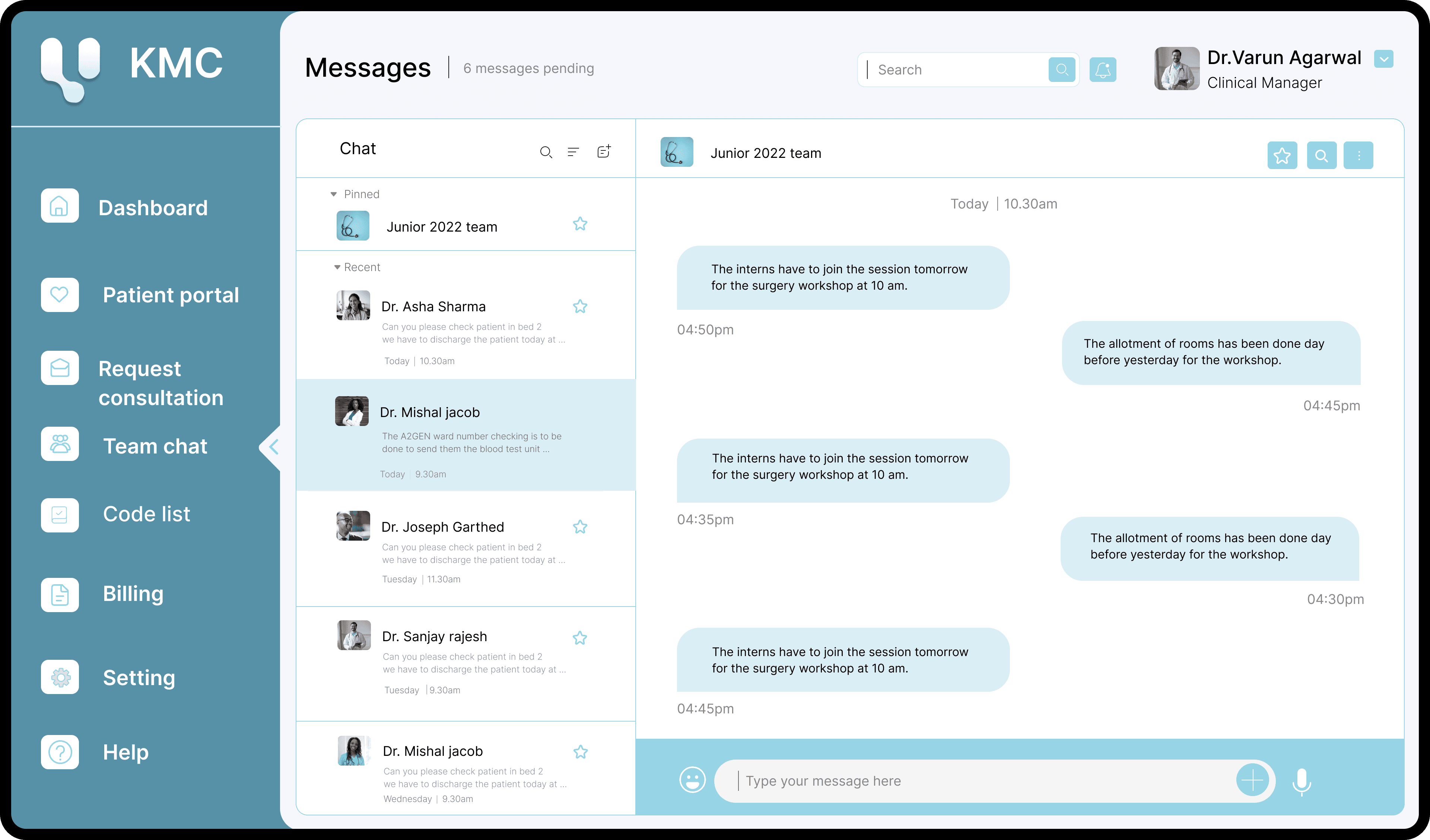
Incoming staff Mobility
Streamlining easy inpatient transfer, treatment, and management into the Urology department.
My responsibilities
02
Web page design to support mobility for incoming Global staff in Newcastle University
During my internship I was assigned with a project task to create a externally facing webpage which will provide all information and support for incoming global staff.I was involved from end to end design process.
Understanding client needs
I conducted open-ended informational interviews with all levels of doctors and nurses in the urology department to understand how they currently shift patients, their pain points, and the tasks they need to perform.
Existing Software study
I conducted a literature review and case study of existing hospital management software to understand the interface design and user flows.
Designing
I created a proposal for a dashboard and two other features, which helped push the project to the next stage of design.
Research
03
Web page design to support mobility for incoming Global staff in Newcastle University
During my internship I was assigned with a project task to create a externally facing webpage which will provide all information and support for incoming global staff.I was involved from end to end design process.
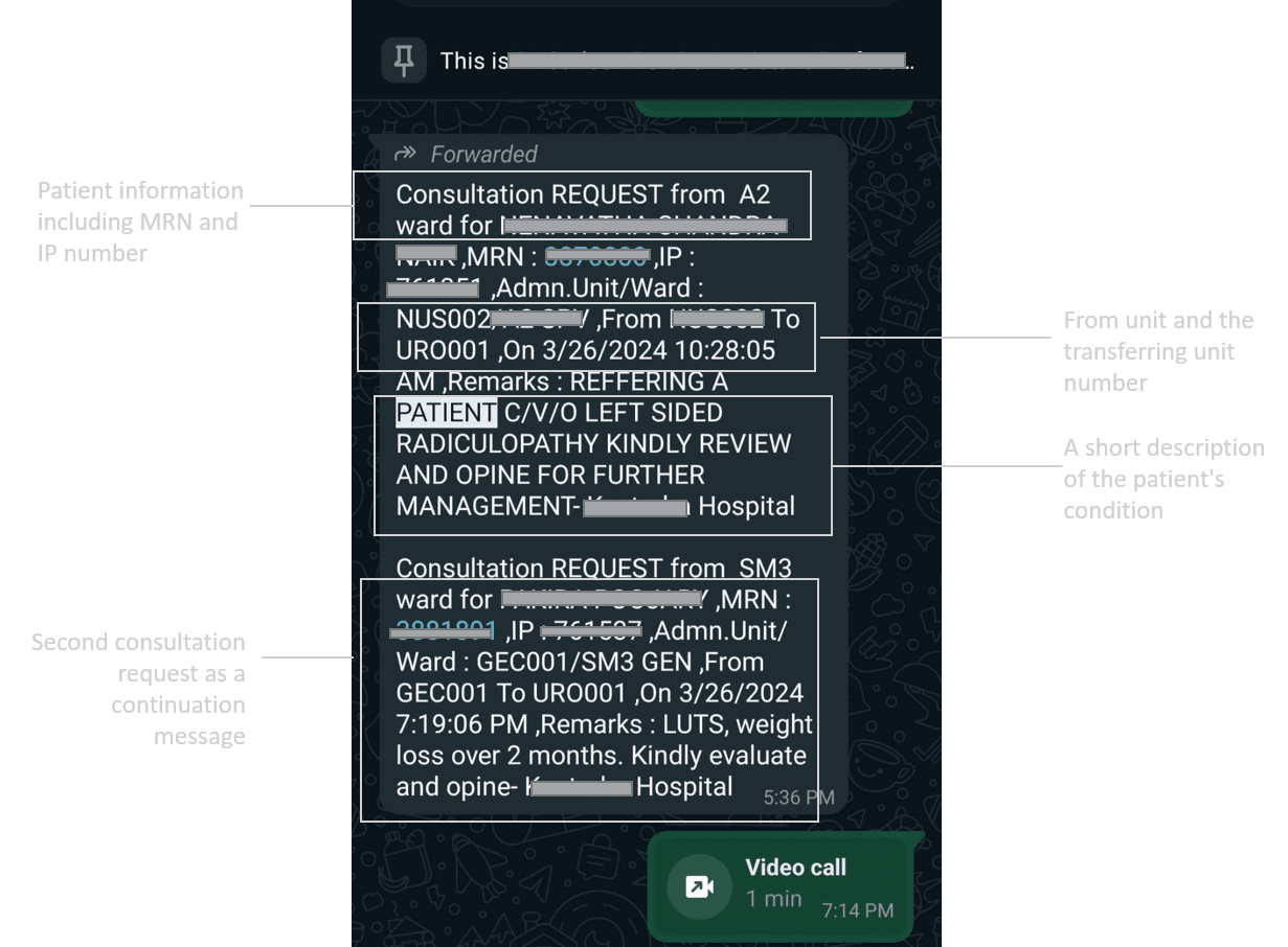
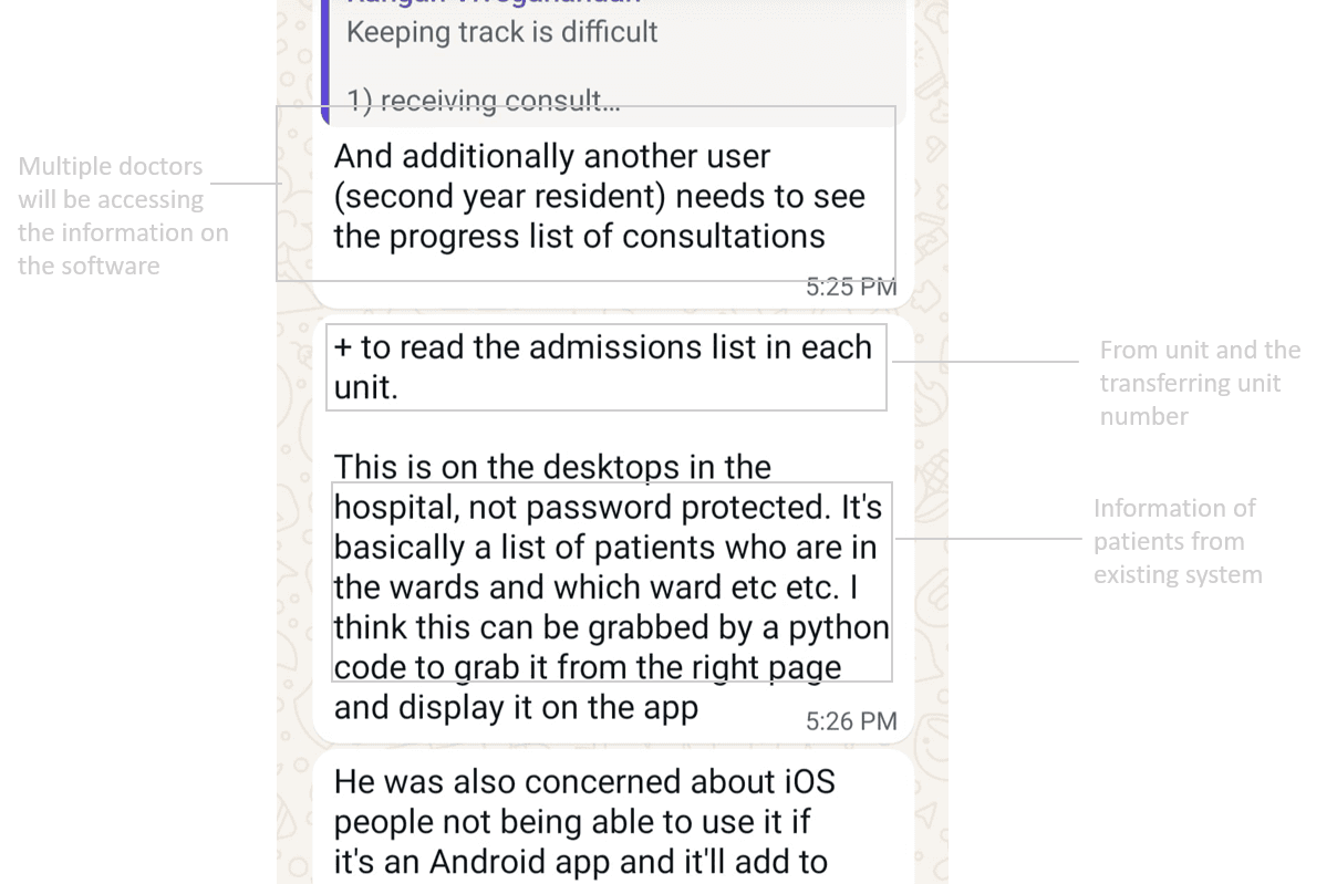
The sharing of information was done on WhatsApp and sent using clustered codes which was confusing
Information about the patient and the consultation is sent through WhatsApp, where junior doctors and nurses struggle to follow up as the patient count increases.
Information set 1
Information set 2
Pain points
04
Doctors found it really
confusing to manage
patients using whatsapp
These pain points helped me analyze and understand how the department works and the doctors' working conditions, allowing me to design a suitable application to meet their needs.
1
Message gap
Due to the consultation information being shared via WhatsApp, multiple doctors are unable to follow the information properly.
2
Multiple calls
The team’s multiple messages and calls for clarifications and reports are overwhelming for doctors who are also treating patients.
3
Missing information
Errors in conveying codes, IP, and MRN numbers risk incorrect patient diagnoses.
4
Confusing report
The flow of consultation and patient details is hard to follow due to WhatsApp messages.
5
Hard finding Codes
Integrating the codes into the app would be better than opening and scrolling through a separate PDF.
Main Challenge
05
Web page design to support mobility for incoming Global staff in Newcastle University
During my internship I was assigned with a project task to create a externally facing webpage which will provide all information and support for incoming global staff.I was involved from end to end design process.
We proposed using creative tools like ClickUp or Trello, but the clients did not accept them, causing the project to stall. Additionally, contacting doctors to obtain relevant information was challenging.
What I did to find a solution
06
Web page design to support mobility for incoming Global staff in Newcastle University
During my internship I was assigned with a project task to create a externally facing webpage which will provide all information and support for incoming global staff.I was involved from end to end design process.
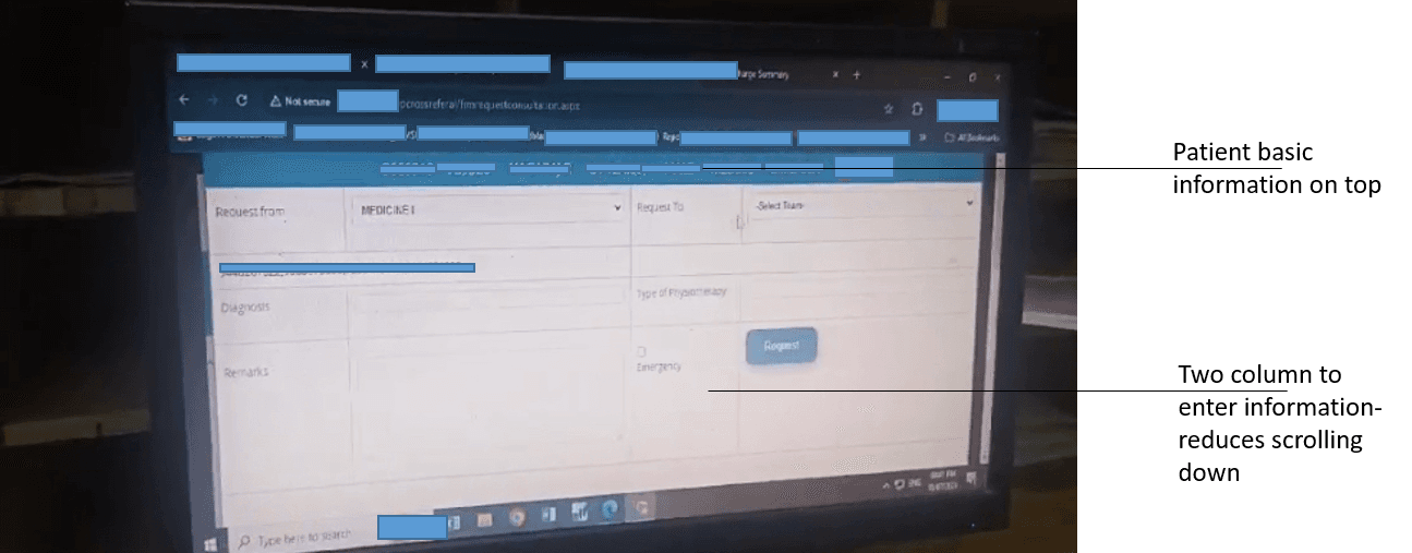
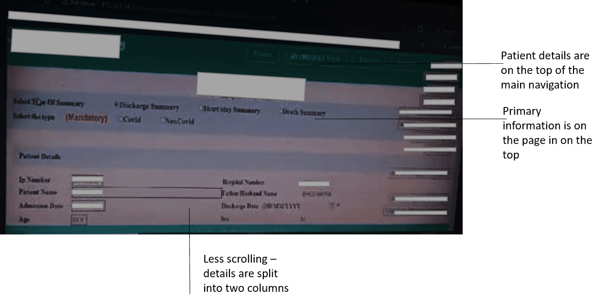
Understanding the existing software’s interface and functionality for familiarity.
I contacted a junior doctor to demonstrate the appearance and functionality of the application they currently use, in order to capture existing system features and integrate them into our design. Doctors are busy and often find it challenging to adopt new systems.
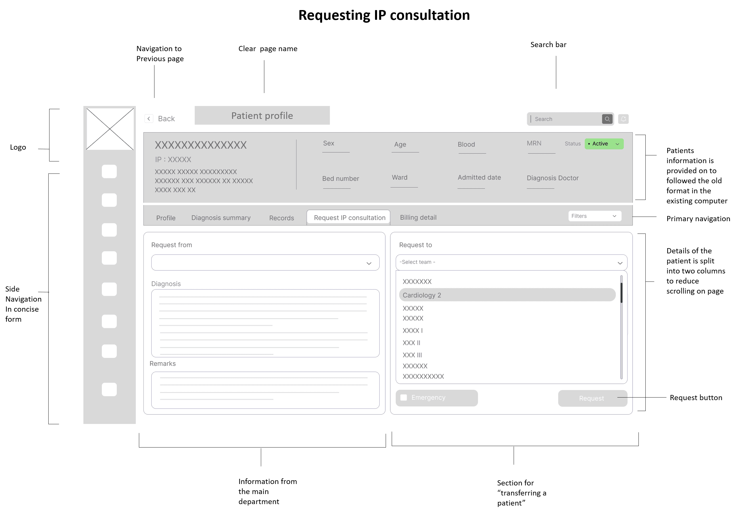
1
Use of two columns
for patient information entry to reduce scrolling
2
Patient information is at the top for quick identification while updating details.
3
Use of clear tabular
column for the incoming
consultation
4
Secondary navigation
towards left of screen to quickly switch pages
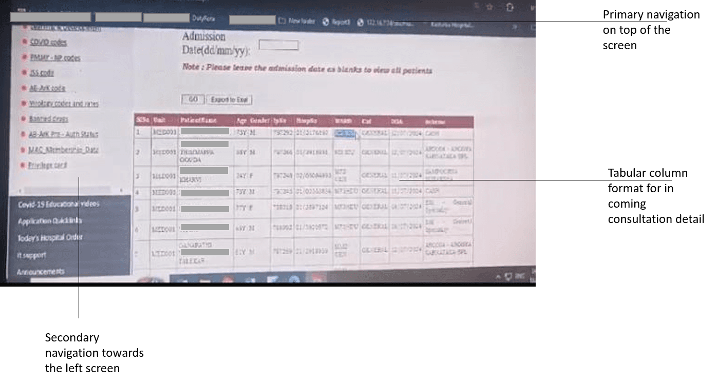
5
Primary navigation is
provided on above the
information are
6
The side navigation bar serves as secondary navigation to help doctors move between pages.

7
Change of sections are
provided on top of the
information area similar to
the previous screen
8
Main information such
as patient general
details on Top of the
screen
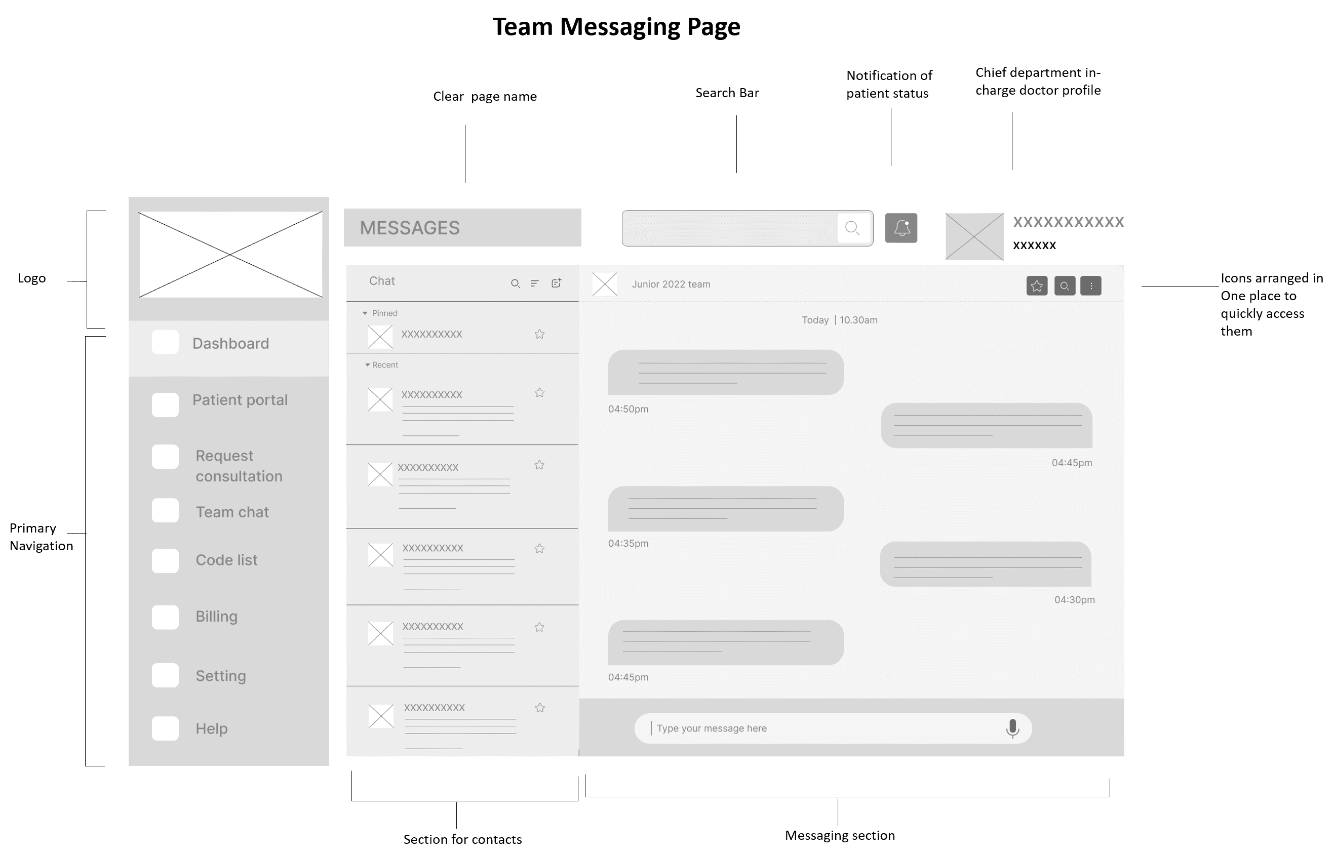
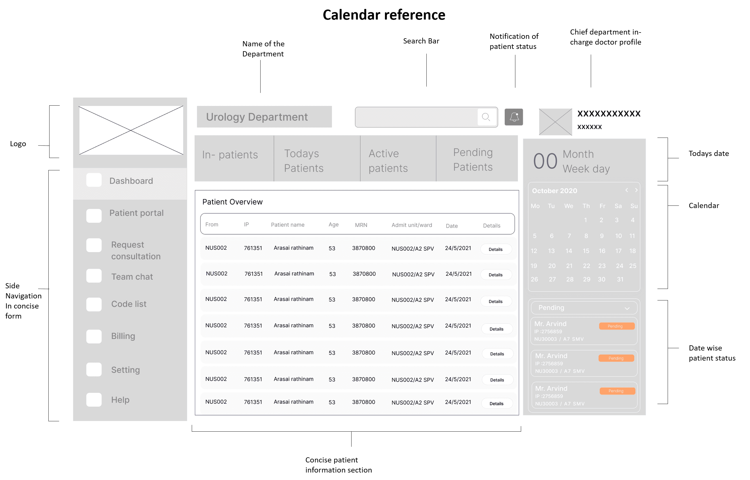
Low Fidelity Prototype
07
Medium- fidelity Wireframes
After understanding the existing system, I transformed the sketches into a mid-fidelity prototype to gain clarity on how tasks are performed in a user-friendly way.

High Fidelity Prototype
08
High Fidelity Prototype
After a few rounds of mid-fidelity user testing, the prototype was approved, and we moved on to designing the high-fidelity version.